
"2 minute men"
Spearfishing Club Name
-
-
I like rainbow girl too!
-
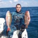
I like Larry's pic more because it is bigger and has more detail
 that girl is a monster...I would like to be her monster slayer
SFS- South Florida Spearos-
FLF- Ft lauderdale FreediversBuilt like that...I wouldn't kick her out of bed if she shit in it.
-
-
we are making serious progress.
-
-
I like Larry's pic more because it is bigger and has more detail
that girl is a monster...I would like to be her monster slayer SFS- South Florida Spearos-
FLF- Ft lauderdale FreediversI would really like to slay her monster..
-
Ok Im having a company make our logo so that it will be very professional, I drew up an idea of what is going to look like, The only problem at this time is the name Adrian and I think that the best name up to this point is ................
Fort Lauderdale Speardivers Club
Please give me some feedback and any good names that you could think off, I will be putting the order in at the beginning of the week
Thank you
-
Speardivers not speardiving; Fort Lauderdale Speardivers is better. Not saying it's perfect..
-
What about
South Florida Speardivers Club
It has a more fluid pronunciation.
-
i like that the best yet.
SFSC
speardivers is my new favorite word,,,somehow it is more distinguished than spearo or spearfisherman, dunno why -
get me a size L

-
Adding a club in the end makes it too long. Obviously it's a club
South Florida Speardivers SFS
Freediving Spearfishing Forum FSF
SFS of FSF
:laughing:
-
id jsut like to say thank you it was a great idea.
-

i think one of the best things that could happen to a spearfishingclub is that some daughters would join the club. so dont call it sons of neptunes.
Sons of a Beach
-
I guess South Florida Speardivers it is......
-
It's starting to sound good to me.
-
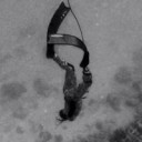
This is the logo that we are going to use, the company that Im using is going to put color and make it a lot better......Feedback is appreciated.
-
I think too much of the area of the logo is not utilized. Meaning the shield is big but the spearifsher representation takes up too small a part of it, it's almost unrecognizable. The idea is good but needs to be reworked. The banners and the shield, everything needs to be more tightly grouped.
-
Actually the shield and banners is too antiquated. I'd go in a different direction.
Anyways Joe I don't think the logo is a priority at this time. You have the name. Membership, objectives, club structure, rules, is what you should now concentrate on. Maybe Twentytwomonk can help you with that, I believe he started a club in Cali.
Create an account or sign in to comment
You need to be a member to leave a comment.